
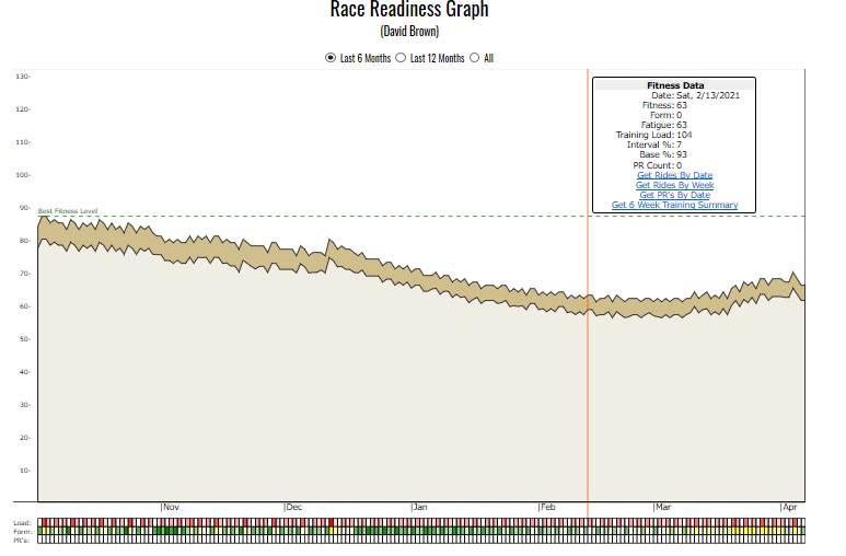
| Clean TRIMP based graph. Cycling analytics systems usually have a graph derived from Roger Bannister's TRIMP (training impulse) concept. The KOM Informatics version is called the Race Readiness Graph. It displays Fitness only in the main area of the graph represented by the topmost line. The gold area underneath the topmost line represents the interval portion of your training. Daily training load is represented by the first horizontal band underneath the main graph. Harder days appear in a brighter shade of red. Form appears directly beneath training load. When you're well rested that day's box will be green, if you're not well rested the box will be yellow. If you set an all-time personal record on a day, that will be reflected as a blue box in the last horizontal row. |
|
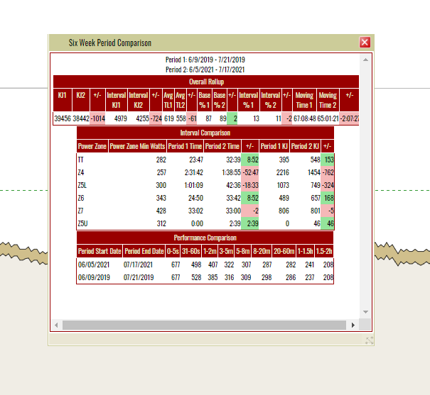
| 6 Week Period Comparison Launched from the Race Readiness Graph, this report provides a training comparison between 2 6 week periods both in terms of overall workload (KJ, Moving Time) and Interval work. A third section provides a performance personal record comparison for the 2 periods. A common use of this capability is to compare a 6 Week Summary based on a past day where either you were at your peak fitness, or you had a notable result like a race podium or Strava KOM, with your last 6 weeks of training. Then you go out and train the areas you're lagging behind in. This rider needs to make up a small deficit in KJ/Moving Time, and add in more Z4 and Z5 interval work. When using the report like this you have to run it on a daily basis because your current data keeps changing. |
|
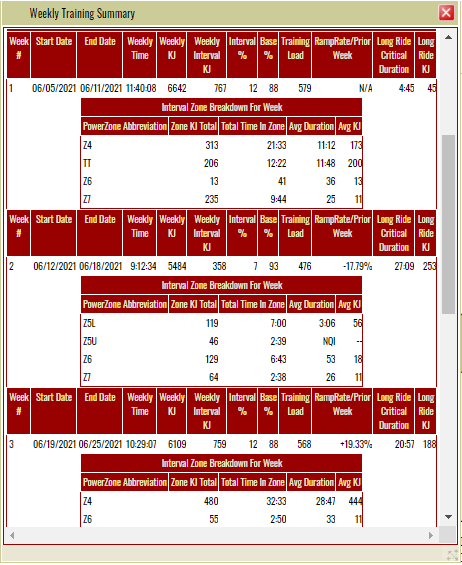
| 6 Week Training Summary Launched from the Race Readiness Graph, this report provides a rollup of all of your interval efforts for the 6 weeks preceding the selected date, plus a week-by-week breakdown. This level of detail provides insights into whether you've been neglecting certain areas of your training (although some block periodization plans do this deliberately). Keeping a close eye on the Ramp Rate/Prior week column can help you to control overtraining. |
|
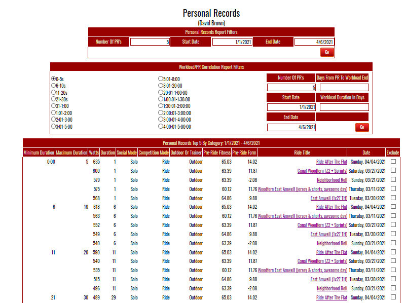
| Personal Records Shows your best efforts in 16 different "time boxes". Just provide how many PR's you're interested in viewing and a date range. This report also provides an entry point for the Workload/PR Correlation report. |
|
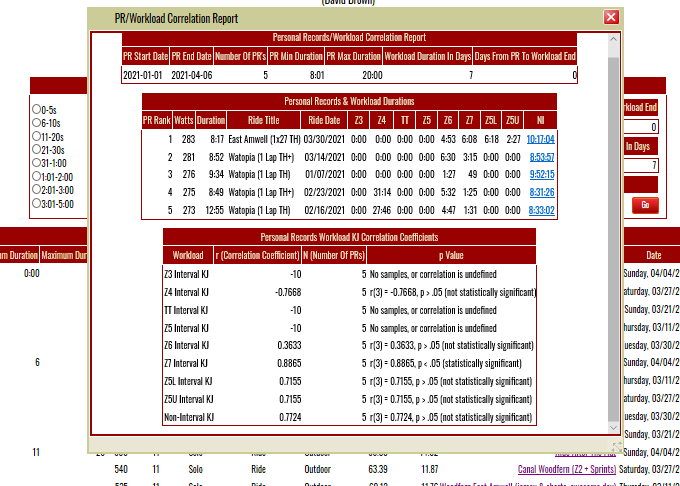
| Workload/PR Correlation Remember all those intervals you've been doing? Here's where KOM Informatics tells you if all that work has been paying off. The Personal Records/Workload Correlation report provides information on the strength and direction of the linear relationship between your training and your performance. It can provide insights into which aspects of your training are having the biggest effect on the performance abilities that can make a critical difference to your success as a competitive cyclist. The training side utilizes the kilojoules recorded for the Interval Zone Durations for each ride, along with the Non-Interval kilojoules for each ride. You specify a workoad window each time you run the report. A workload window is a block of training days which are defined by the days from the PR to the workload end (looking back in time), and the duration of the workload in days. The report uses Personal Records wattages on the performance side. The example to the right is looking at a workload window of 7 days looking back in time from the day of the PR. It's looking at the 5:00 - 8:01 minute time box. It found a statistically significant correlation between KJ expended in Z7 (neuromuscular) training and personal record wattage. In general, as long as the workloads involved are not small (your legs should be able to answer this question) where statistically significant correlations like this occur, there is a high probability that the workload category had a significant role in attaining a PR. |
|
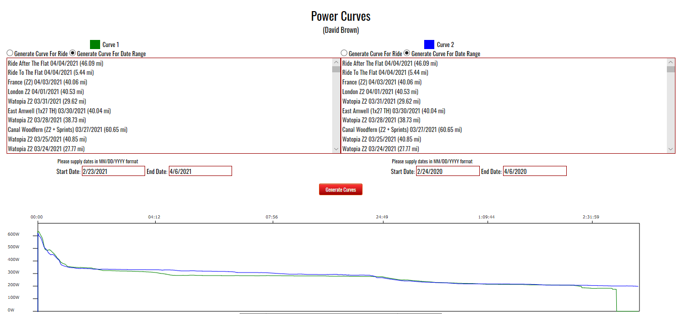
| Power Curves The Power Curves report displays best efforts for either an individual ride or date range against another individual ride or date range. This can be a good way to gauge progress or lack thereof. You can pick points from this graph to serve as a Critical Power report trials. |
|
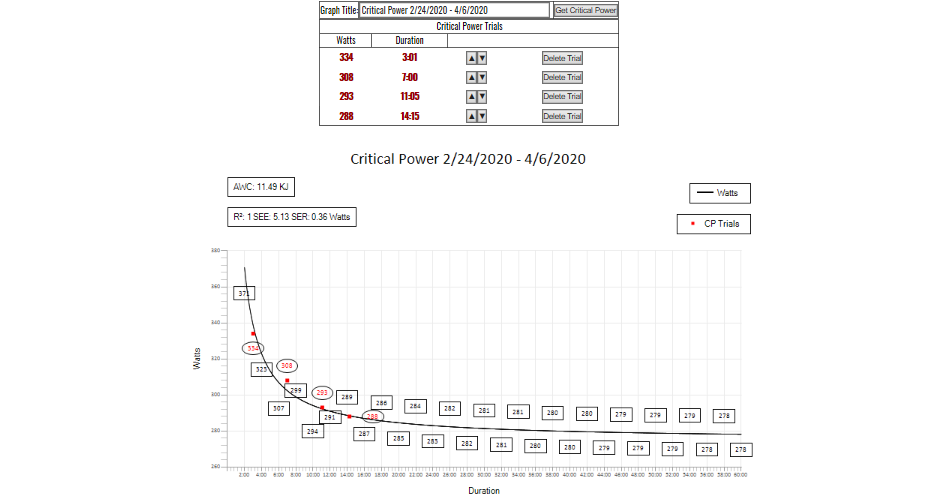
| Critical Power Report After picking points from the Power Curves report to serve as Critical Power trials you can generate a critical power graph. Graphs are implemented as images which you can save to your local file system to archive your progress. Here is a link to an article which discusses the history and uses of Critical Power. |
|
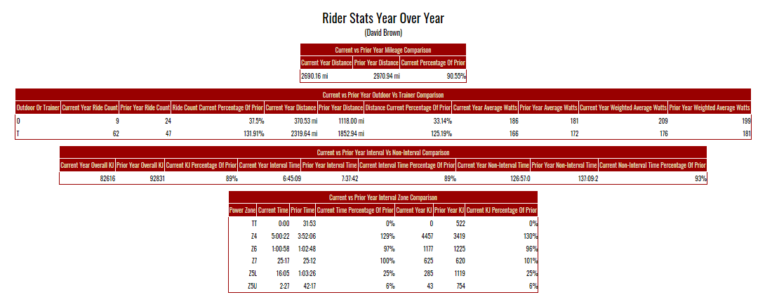
| Rider Stats Year Over Year Report Shows several different metrics for current vs prior year based on the day of the year of the current year. |
|
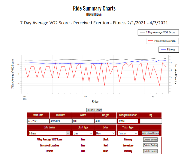
| Ride Summary Charts Ad hoc charting of over 40 ride summary statistics based on a date range you provide. Graphs are implemented as images which you can save to your local file system to archive your progress. |
|
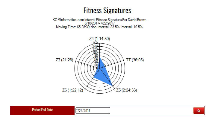
| Fitness Signatures A Fitness Signature is a spider or radar type of chart that represents your interval efforts over a 6 week period which you supply the end date for. |
|